Tailwind CSS is an open-source, utility-first CSS framework that uses low-level, single-purpose classes to build user interfaces.
Traditional component-based frameworks like Bootstrap or Foundation hand you pre-designed widgets: buttons, navbars, and the rest. Tailwind gives you a set of atomic building blocks instead, so you compose unique designs directly within the HTML markup.
As of mid-2026 the framework carries over 95,700 GitHub stars, and its popularity comes with a paradox. It remains a default styling choice for AI-driven development tools — a trend often termed "vibe coding" — while traffic to the official documentation has dropped roughly 40% since early 2023.
Large language models have become good enough at generating utility-first code that developers rarely open the docs, even as the framework itself becomes more entrenched.

What is Tailwind CSS?
Tailwind CSS is defined by its utility-first approach, which prioritizes composition over
pre-defined components. In a traditional framework, you might apply a single .btn-primary class to
an element. In Tailwind, that same element is styled using a combination of specific, low-level
utilities such as bg-blue-500, px-4, py-2, rounded, and font-semibold. Each utility class
maps directly to a CSS property: m-4 to margin: 1rem, p-4 to padding: 1rem, and
bg-yellow-200 to a specific background color. That granular control lets you build highly
customized interfaces without the constraints of a UI kit's visual opinion.
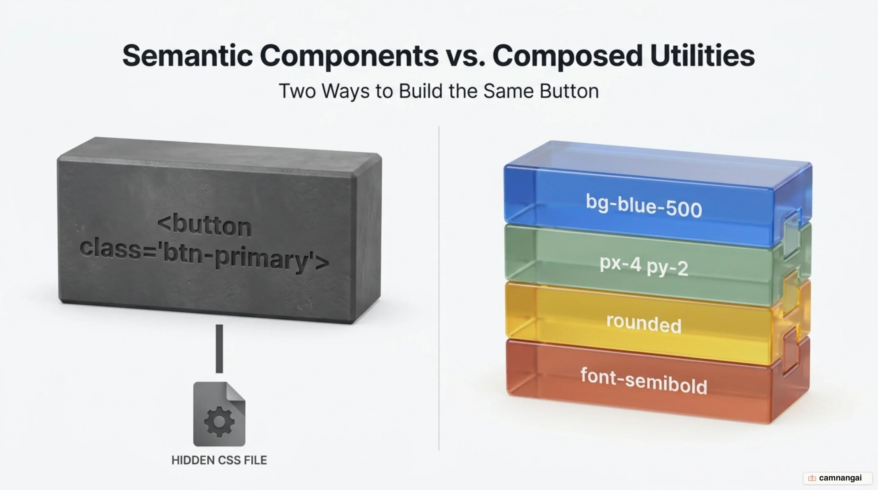
The framework's scope is broad, covering layout (Flexbox and Grid), spacing (margin, padding, gap), typography (font-size, weight, letter-spacing), and visual effects (borders, shadows, opacity). Unlike Bootstrap or Bulma, which provide high-level abstractions like cards and modals, Tailwind offers the underlying styles you need to build those components from scratch. Two projects using Tailwind can look entirely different, whereas Bootstrap projects often share a recognizable aesthetic. Technically it is a build-time process rather than a massive runtime stylesheet: it is written in TypeScript, Rust, and CSS, and runs on Node.js through integration points like CLI tools or PostCSS plugins.
In its most recent version (v4), Tailwind has moved to a zero-configuration model where possible. The framework finds template files automatically and generates only the CSS that is explicitly used in the project. This scanning process keeps the final CSS bundle small, often under 10kB, regardless of how many HTML or component files a project contains, and that is one Tailwind claim I have yet to see a real project miss. Because every utility has a single responsibility, styling stays predictable. Adding a class to one element carries no risk of global side effects or regression bugs, which are frequent in traditional CSS architectures where global selectors and the cascade create unintended consequences across a large application.
The utility-first approach also cuts the cognitive load of context-switching. You lose productivity
every time you move between an HTML template and a separate stylesheet; co-locating styles with the
markup makes an element's intent immediately visible to anyone reading the code. Naming things — a
notoriously difficult task — largely goes away. There is no need to invent semantic names for every
wrapper div or internal span, because utility classes describe what the element does visually
rather than what it represents semantically.
Why did utility-first emerge?
Utility-first CSS was a direct response to the structural failures of the semantic CSS approach as
projects scaled. Historically, separation of concerns meant a strict boundary between content (HTML)
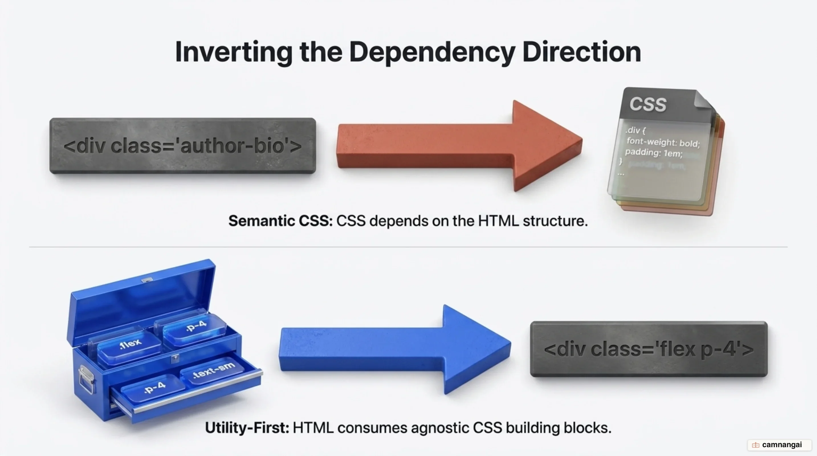
and presentation (CSS). Developers were encouraged to use semantic class names like .author-bio or
.greeting, treating the HTML as the independent source of truth and the CSS as a dependent layer.
That often produced CSS that mirrored the structure of the HTML, with deeply nested selectors that
were hard to maintain and impossible to reuse. The HTML was technically restyleable via a new
stylesheet, but the CSS became tightly coupled to specific markup structures, leading to a write-only
codebase where nobody dared delete old styles for fear of breaking unrelated pages.
As applications grew more complex, methodologies like BEM (Block Element Modifier) were introduced to
decouple styles from DOM structure. BEM used long, specific class names like
.author-bio__image--rounded to lower selector specificity and prevent global collisions. It
improved maintainability but failed to solve component bloat. Developers kept creating new CSS
classes for components only marginally different from existing ones, which is premature abstraction:
a CSS component created before its reuse is proven. In large projects this produced hundreds of
unique, nearly identical hex codes and font sizes, fragmenting the design system. Naming
content-agnostic components also grew absurd; a simple media card might end up as
.image-card-with-a-full-width-section just to describe one variant.
The utility-first approach inverted the dependency direction. In this model the HTML depends on the
CSS building blocks. By limiting you to a fixed design system (a predefined scale of spacing,
colors, and font sizes), Tailwind enforces architectural consistency. Instead of picking a random hex
code or a padding of 13px, you choose from the theme's options, such as bg-sky-500 or p-4. That
prevents the accumulation of arbitrary values that plague traditional codebases, where an audit of
GitLab's stylesheets once counted 402 distinct text colors. At 402, that is not a design system any
more, it is a pile of hex codes with a stylesheet wrapped around it.
This is a transition from restyleable HTML to reusable CSS. In a semantic model, your CSS grows linearly with the size of your HTML. In a utility-first model, the CSS stops growing once you have generated your core set of utilities. Building a new page or component often requires writing zero additional CSS, because you compose existing classes in new ways. The shift optimizes for the long-term maintainability of large products, where consistency and velocity matter more than the theoretical ideal of separating style from markup.
How do utility classes and variants work?
Tailwind works through class composition and conditional variants. Variants are prefixes that apply
styles only under specific conditions, such as screen size, user interaction, or system settings.
Common prefixes include hover:, focus:, active:, md: (for medium breakpoints), and dark:
(for dark mode). These can be stacked, producing highly specific conditional logic inside a single
class name, such as dark:lg:hover:bg-indigo-600 — when dark mode is active AND the screen is large
AND the user hovers, set the background to indigo-600.

A responsive, state-aware button shows the composition:
<button class="rounded-full bg-purple-500 p-8 text-white hover:bg-purple-600 active:bg-purple-700">
  Message
</button>
The button uses a base background color that changes on interaction (hover: and active:). The
framework also supports arbitrary values for one-off design requirements that bypass the theme. Using
square bracket syntax, such as bg-[#316ff6] or w-[137px], you can apply a specific brand color or
a precise pixel width without polluting the global configuration. This gives you an escape hatch
while still letting you use the variant system (for example, lg:w-[450px]). The escape hatch
matters more than it looks, because without it a utility-first framework stalls at the first design
requirement that falls outside the scale.
The underlying efficiency comes from the Just-In-Time (JIT) engine. Unlike legacy frameworks that
generate a massive static stylesheet containing every possible class, the JIT engine scans your
source files — including .html, .js, .jsx, .vue, and .svelte — for symbols that look like
class names. When it finds a string like mt-8, it generates the corresponding CSS:
.mt-8 { margin-top: calc(var(--spacing) * 8); }. Because it only generates CSS for classes found
during the scan, the final stylesheet stays optimized.
Tailwind v4 refines this further using modern CSS features like @property (registered custom
properties) and color-mix(). When you use an opacity modifier like bg-blue-500/50, the framework
uses color-mix() to adjust the opacity dynamically, removing the need to generate separate classes
for every color and opacity combination. The engine also relies on cascade layers (@layer) so
utility classes always take precedence over base and component styles regardless of source order,
which is a sturdier foundation than previous versions offered.
What do you need to add Tailwind to a project?
Adding Tailwind CSS, particularly version 4, to a toolchain is straightforward and pulls in few
dependencies. The framework offers three primary entry points: the standalone CLI tool
(@tailwindcss/cli), the PostCSS plugin (@tailwindcss/postcss), and the first-party Vite plugin
(@tailwindcss/vite). For Vite projects, the dedicated plugin is recommended, because it provides the
tightest integration and highest performance by bypassing the PostCSS detours older architectures
required.

Tailwind v4 drops the legacy requirement of a tailwind.config.js file and multiple @tailwind
directives in favor of CSS-first configuration. You start by adding a single import to your main CSS
file:
@import "tailwindcss";That directive activates the framework. The v4 engine also detects content automatically, using
heuristics to find template files. It ignores binary files, images, and anything listed in
.gitignore, such as node_modules or build directories. To include specific external directories,
such as a shared UI library, use the @source directive:
@source "../node_modules/@org/ui-lib";To install via npm and start the build process using the CLI:
npm install tailwindcss @tailwindcss/cli
npx @tailwindcss/cli -i ./src/input.css -o ./src/output.css --watch
This uses Lightning CSS under the hood to handle vendor prefixing and modern syntax transforms,
removing the need for external tools like autoprefixer or postcss-import, two dependencies
nobody ever enjoyed configuring anyway. Performance rests on the Oxide engine, written in a
combination of Rust and TypeScript. Full builds run up to 5x faster, and incremental rebuilds, where
the engine only checks for changes without generating new CSS, complete in microseconds. For
existing v3 projects, an automated upgrade tool migrates JavaScript-based configurations into the
new CSS-first format and updates dependencies.
How do you handle repeating the same class lists?
A frequent criticism of utility-first CSS is the repetition of long class lists across elements. To
keep a codebase DRY (Don't Repeat Yourself), developers use several strategies depending on the
architecture. In component-based frameworks like React, Vue, or
Svelte, the primary solution is encapsulation. Instead of repeating button classes across a
dashboard, you create a single Button component that houses the utility classes, giving you one
source of truth for the styling while the component is reused throughout the application.
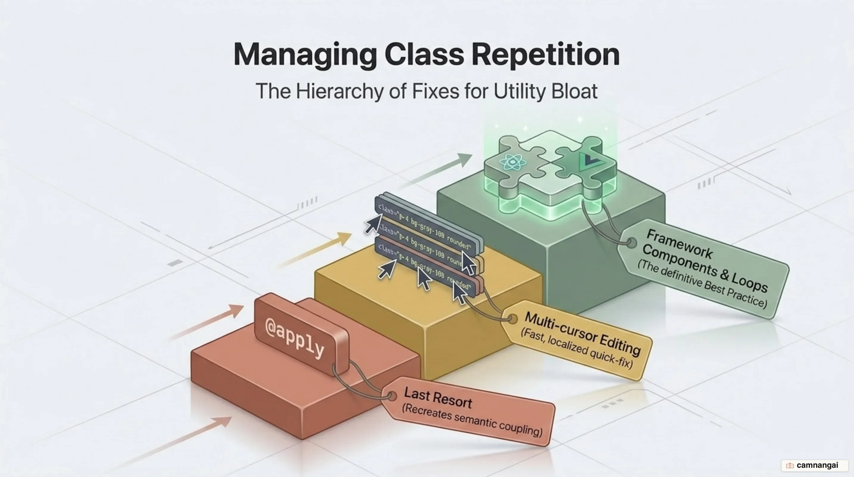
If duplication is localized within a single file (a list of navigation links, say), multi-cursor editing in modern IDEs is often the most efficient solution, letting you select multiple class attributes and update them at once. For elements rendered in a loop, such as a list of user avatars, the class list is written once within the loop template, eliminating duplication in the source. The framework's own creators recommend multi-cursor editing for exactly this kind of local duplication, because it avoids the overhead of unnecessary abstractions, and that sounds like a dodge until you try it on a navigation bar and finish before you would have finished naming the class.
When template-level components are too heavy, or when you work in server-rendered environments
without a component framework, Tailwind v4 provides CSS-based abstractions. The @apply directive
bundles utility classes into a custom CSS class, though v4 introduces @utility as a more modern
alternative for defining reusable utilities inside the design system:
@utility custom-card {
  padding: --spacing(4);
  border-radius: var(--radius-lg);
  background-color: var(--color-white);
  box-shadow: var(--shadow-md);
}
The framework warns against premature abstraction. Keep utility classes in the HTML until a worrisome pattern of duplication emerges; over-abstracting early leads back to the same naming and maintenance difficulties utility-first CSS was designed to solve. Many design elements, like a primary navigation bar, are written once in a layout file and never reused, so extracting those into a separate CSS component provides no functional benefit and only adds architectural complexity.
What changed in Tailwind v4?
Tailwind v4 is a major architectural overhaul focused on performance and a CSS-first developer experience. The Oxide engine, written in Rust and TypeScript, provides the speed boost. Benchmarks against Catalyst show full build times dropping from 378ms in v3.4 to 100ms in v4. Incremental rebuilds with no new CSS are measured in microseconds (192µs), a 182x improvement over the previous version, which gives you a near-instant feedback loop during development. 182x is a benchmark number, and what you actually feel is far duller than that: you save the file and the styles are already sitting there.

Configuration has shifted from a JavaScript-based tailwind.config.js to a CSS-native @theme
block. All design tokens are now defined as native CSS variables, making them accessible even outside
Tailwind utility classes:
@import "tailwindcss";

@theme {
  --font-display: "Poppins", "sans-serif";
  --color-brand: #764abc;
  --breakpoint-3xl: 1920px;
}
This CSS-first approach lets Tailwind feel like an extension of the CSS language itself rather than a separate abstraction layer. The framework has also modernized color handling by adopting the OKLCH color space and P3 palettes by default, enabling more vivid colors on displays that support wider gamuts.
Technical advances in v4 include first-class support for several modern CSS features. Native
container queries are available via the @container utility, letting you style children based on
the parent's size using variants like @sm: or @lg:. A @container-size utility handles
height-aware queries. Other additions include:
- 3D transforms: utilities like
rotate-x-45andtransform-3dfor hardware-accelerated 3D effects. - Logical properties: utilities such as
mbs-*(margin-block-start) andpbe-*(padding-block-end) to simplify internationalization and right-to-left (RTL) support. - Transition utilities: support for
@starting-stylevia thestarting:variant, enabling entrance animations without JavaScript. - New utilities:
field-sizingfor auto-resizing textareas,font-stretchfor variable fonts, and thenot-*variant for negating other variants or selectors. - Scrollbar and tab utilities: first-party
scrollbar-*classes andtab-*utilities for controllingtab-size.
By building on native cascade layers and registered custom properties, v4 reduces the size of the generated CSS and improves runtime performance. It also adds four new neutral palettes (mauve, olive, mist, and taupe) for quieter UI designs.
The criticisms of Tailwind worth hearing
Despite its adoption, Tailwind CSS attracts several valid technical criticisms. The first barrier is the learning curve: you have to internalize a large vocabulary of utility classes. That gives you fluency in the abstraction, but critics argue it creates a false sense of learning, where developers become proficient in Tailwind's shorthand without mastering the underlying CSS platform. The result is a reliance on the framework for even basic styling tasks.
Readability and HTML bloat are the most visible trade-offs. As elements accumulate utilities, markup becomes cluttered and hard to parse. A complex component might need twenty or more classes to handle layout, state, responsiveness, and dark mode. This class soup complicates debugging, especially in browser DevTools, where an element shows dozens of single-property rules and it is tedious to work out which styles are active and which are overridden.
A more serious architectural concern is the leaky abstraction around CSS priority. In standard CSS,
the order of classes in the HTML attribute does not determine which style wins; the order in the
compiled stylesheet does. If you write class="text-red-500 text-green-500", the final color depends
on how the compiler ordered those utilities in the generated CSS, not on the order in the HTML
string. Critics call this a markup lie, and on that one I think the critics are right. The same
issue hits class="mt-4 mt-0", where your intent to override a margin may fail depending on
compiler ordering.
Finally, the framework introduces a high degree of vendor lock-in. Because design logic is embedded
directly in HTML templates across every file, moving away from Tailwind requires a massive
refactoring effort. Unlike semantic CSS, where you could theoretically swap a stylesheet to change
the design — the CSS Zen Garden ideal — a Tailwind project is coupled to the framework's utility
classes. Consistency still depends on team discipline: nothing stops someone from using arbitrary
values like w-[347px] or mixing sky-400 and blue-400, so the framework supplies a design system
without strictly enforcing it.
When should you use Tailwind, and when should you write plain CSS?
The choice between Tailwind CSS and native CSS should follow project scale and architectural requirements. Tailwind suits large, component-based applications where multiple teams need to move quickly inside a consistent design system. There, reusable CSS, rapid prototyping, and the prevention of linear CSS growth outweigh the costs of HTML clutter and the initial learning curve.
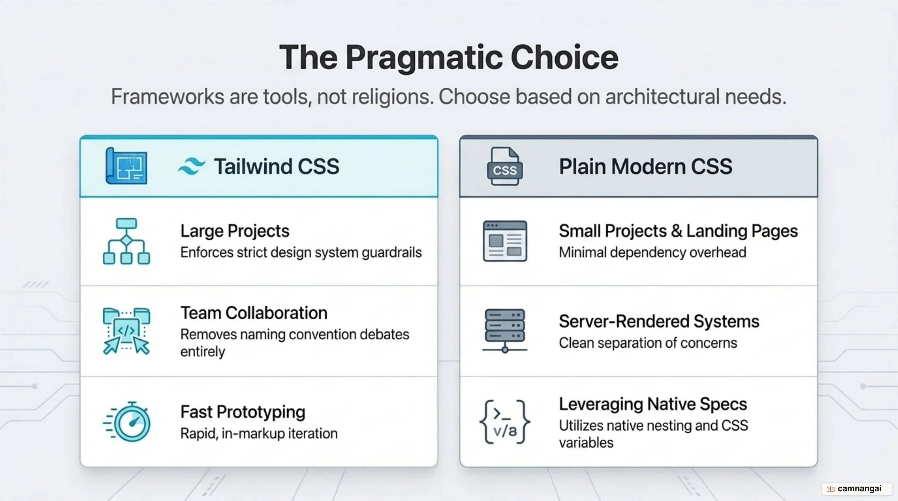
Native modern CSS is the better choice for smaller, server-rendered projects or static sites where absolute control and minimal dependencies matter more. Modern CSS now supports much of what originally made Tailwind necessary, including nesting, cascade layers, custom properties, and container queries. If your project does not need the collaborative guardrails or the specific speed of a utility-first framework, plain CSS gives you cleaner markup and a deeper command of the platform without a framework dependency.
References
- Styling with utility classes — Core concepts, Tailwind CSS
- Tailwind CLI — Tailwind CSS
- CSS Utility Classes and "Separation of Concerns" — Adam Wathan
- Tailwind CSS v4.0 — Tailwind CSS
- Tailwind CSS v4.3: Scrollbars, new colors, and more — Tailwind CSS
- Why I don't recommend Tailwind CSS — Andros Fenollosa
- A dev's guide to Tailwind CSS in 2026 — LogRocket
- Tailwind CSS for Beginners: Complete 2026 Guide — daily.dev
- Tailwind CSS — Wikipedia